Building A Custom Gradio Slider
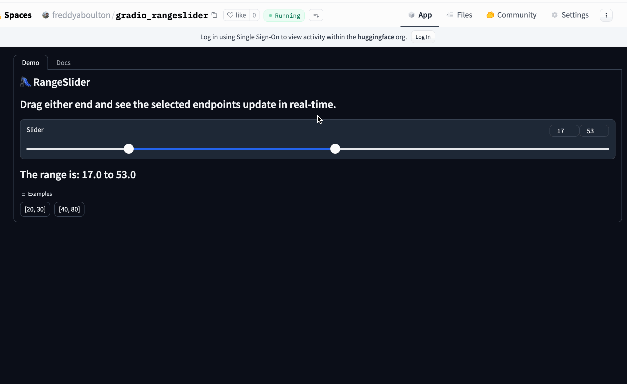
Building a Range Slider 🛝
I really like Gradio’s custom components. If Gradio’s core components do not perfectly fit your use case, you can unblock yourself by implementing a component of your own!
The most recent example of this was when the open eval team at HuggingFace wanted to be able to filter models in the Open LLM Leaderboard by model size. They wanted users to be able to set the lower and upper bounds of the model size and only show models in that range.
In this post, I will show you how I implemented a custom slider component called RangeSlider for this use case.
Scaffolding the project
Starting a custom component is easy with the Gradio custom component command-line-interface (CLI).
I used the create command and the --template option to create a new custom component from the current Slider component in Gradio.
I highly recommend you run the create command in a virtual environment or conda environment.
The create command will create a new directory with the following contents:
backenddirectory. This is where the python interface of your custom component lives.frontenddirectory. This is where the visual user interface (UI) is defined.demodirectory. A demo you can use to showcase your component on Hugging Face Spaces.pyproject.tomlfile. This is used to build the directory into a python wheel others can install from PyPi.READMEfile. This is the landing page of your component on PyPi as well as the configuration of the space on Hugging Face.
The Backend
I like to start by developing the python logic of the custom component.
So the first thing I did was define a data_model.
The data_model is the data format the frontend and backend will use to communicate.
I want the data to be sent back and forth as a tuple of two floats, so I implemented a
RangeSliderData class and set it to the data_model attribute of the RangeSlider class.
Gradio leverages Pydantic to define data models so the RangeSliderData class behaves similarly to a pydantic Root Model.
I left the __init__ method of the class unchanged (except changing the type hint of the value parameter to be a tuple). Now it’s time to update the component methods to handle the new data_model class we defined.
For the example_playload and example_value methods, I will return the maximum possible range.
The postprocess method will package the tuple the user returns from their function into a RangeSliderData instance.
The preprocess will take the RangeSliderData instance from the frontend and serialize it into a tuple.
Each of these methods can be defined in one line!
The frontend
I’m more comfortable in python than svelte, html, or css so in my experience, defining the frontend of a custom component is trickier than the backend.
But I don’t let that dissuade me! I simply ask Llama 3 70b on Hugging Chat for help 🙈 All jokes aside, LLMs are really good at svelte, html, and css so asking for a generic svelte component that does what you want and then adding the Gradio logic afterwards works quite well. It’s what I did in this example!
I like to think of Svelte components as broken up into three separate parts:
- The UI defined in plain HTML and other svelte components
- The
<script>section is where all the reactivity is defined. - The
<style>section is where CSS is defined.
I’m going to tackle each section separately.
The UI
At the top level, I place the component inside a <Block> component, which handles the visibility, loading status, and other common properties. This code was already present in the Slider template so I did not modify it.
Below the <div class="wrap">, I place two numeric input components to display the current value of the left and right bounds of the range. The range-slider div implements the actual range slider. It consists of a background <div class="range-bg">, a <div class="range-line"> that represents the selected range, and two <input type="range"> elements for the minimum and maximum values.
The bind:value directive binds the input values to the selected_min and selected_max variables, and the on:input directive calls the respective change handlers when the user interacts with the slider.
The Script Section
This script section handles the interaction between the range slider and the component’s value.
The handle_change function dispatches the change and input events with the selected minimum and maximum values. The handle_min_change and handle_max_change functions ensure that the minimum value never exceeds the maximum value and vice versa.
The script also updates the selected_min and selected_max values whenever the value property changes. Finally, it calculates the position and width of the range line based on the selected values and the minimum and maximum values of the range.
CSS
I left most of the css unchanged but I styled the classes I created.
The .numbers class styles the input fields for the minimum and maximum values and makes sure they are displayed in a flex row.
The .range-slider class positions the range slider and its elements. The input[type=“range”] selector styles the slider track and thumb. It’s important to use the webkit and moz media queries so that the slider looks good in both Chrome and Firefox.
The .range-line class represents the selected range. I use the --slider-color CSS variable defined in gradio so that the color matches the standard Gradio theme and any custom themes defined by the user. The .range-bg class provides the background “greyed-out” track for the unselected area.
Conclusion
We have successfully built a custom range slider component in Gradio. By now you should know how to:
- Scaffold a new custom component using the Gradio CLI
- Define the data model and methods for your component
- Handle user interactions with JavaScript
- Structure your component’s HTML
- Style your component with CSS
You can now apply these concepts to create your own custom Gradio components.
Further Reading: